Popup document
The JSON behind every popup. You rarely write it by hand, but it's good to be able to read it.
Here is the newsletter template in full:
{
  "blocks": [
    { "id": "h1", "kind": "HEADING", "content": "Join the list" },
    { "id": "p1", "kind": "PARAGRAPH", "content": "One email when something worth reading goes up." },
    { "id": "b1", "kind": "INPUT", "type": "EMAIL", "label": "Email", "required": true }
  ],
  "settings": { "name": "Newsletter signup" },
  "popup": {
    "layout": "center",
    "size": "md",
    "overlay": true,
    "closeButton": true,
    "animation": "fade",
    "trigger": { "kind": "delay", "seconds": 10 },
    "frequency": { "kind": "days", "days": 7 },
    "action": { "kind": "close" }
  }
}
It has three parts. blocks is what’s inside the popup, settings is for you, and popup controls where, when and how often it appears.
This page covers the parts you’ll run into most. For the complete list, ask your agent to call popup_schema.
Blocks
Blocks are listed in the order they appear. Each one has an id and a kind.
| Kind | What it needs |
|---|---|
HEADING, TITLE, LABEL, PARAGRAPH | content, the text. TITLE and LABEL are smaller text styles than HEADING. A paragraph can contain simple HTML, so this is where links go. A link to your own page, like /sale, opens in the same tab; a full https:// link opens a new one. |
INPUT | A type and a label. Optionally placeholder, required, options and the settings of its type (below). |
IMAGE | mediaUrl and imageAlt. Optionally imageCaption, and imageLink to make it a link. |
VIDEO | mediaUrl, an https:// link, and content, what it shows. A YouTube, Vimeo or Loom page becomes that service’s player; a direct .mp4 or .webm file plays muted, inline and looping, like a GIF, with a pause button. |
DIVIDER | Nothing. |
PAGE_BREAK | Nothing. Everything after it goes on the next page of the popup. buttonLabel sets the text of its Next button. With isThankYou: true, what follows is the thank-you screen, which stays up after a submit until the visitor closes it. |
CONDITIONAL_LOGIC | A rule that shows, hides or requires other blocks, or jumps to a page. See Questions that depend on answers. |
Two things work inside text:
- A discount code. Wrap it in
<code>in a paragraph, as inUse <code>SAVE10</code> at checkout., and the popup draws it as a chip with a Copy button. - An earlier answer.
@{{name|there}}in a heading, a paragraph or a question’s label puts in what the visitor answered to the question whoseidisname, or “there” if they left it empty. It’s inserted as plain text, never as HTML.
Field types
An input’s type can be TEXT, LONG_TEXT, EMAIL, PHONE, NUMBER, DATE, SINGLE_CHOICE, MULTI_CHOICE, DROPDOWN, RATING, SCALE, LINK, FILE or SIGNATURE.
The three choice types take their options as a simple list of strings, for example "options": ["Small", "Medium", "Large"].
LINK is a box the visitor types a web address into. It is not a button: a call to action is a link inside a paragraph.
Each type has a few settings of its own:
| Type | Settings |
|---|---|
EMAIL | verifyEmail: true asks the visitor to confirm the address with a code before they can submit. See Verified email addresses. |
TEXT, LONG_TEXT | minChars, maxChars. |
NUMBER | minNumber, maxNumber. |
DATE | minDate, maxDate (YYYY-MM-DD), and disabledDays: any of past, future, mon … sun. |
SINGLE_CHOICE, MULTI_CHOICE, DROPDOWN | hasOtherOption: true adds an Other row the visitor types into. randomizeOptions: true shuffles the options for each visitor. A multi-choice takes minChoices and maxChoices. optionImages, a list of picture links in the same order as options, draws the two choice types as picture tiles. |
RATING | ratingMax, the number of stars (5 by default). |
SCALE | scaleStart and scaleEnd (0 and 10 by default), scaleStep, and the captions scaleLeftLabel, scaleCenterLabel and scaleRightLabel. A 0 to 10 scale is read as an NPS question. |
FILE | The visitor attaches a file. maxFileSize in MB (10 by default, 25 at most), allowedFileTypes such as [".pdf", ".docx"], and allowMultipleFiles: true with maxFiles (up to 5). Only images, PDF and Word, Excel or PowerPoint files are ever accepted. |
SIGNATURE | The visitor draws a signature. signatureLabel is the hint under the line, such as “Sign here”. |
The Spam check is a block too: { "id": "sc", "kind": "CAPTCHA" }, a Cloudflare Turnstile widget drawn exactly where it sits, so put it on the last page, just before the submit button. A popup has at most one, and one without it isn’t checked. It has no settings: it follows the popup’s light or dark theme. It needs a Turnstile key that covers the popup’s site: the deploy’s own on a site under the deploy’s domain, or the site’s own keys, pasted on the dashboard’s Sites page. Without one, a popup that has it can’t be published.
Files and signatures are kept in your deploy’s private storage, never in the answer itself. You download them from the dashboard’s Leads page; everywhere else (the CSV, a webhook, your mailing list) they show as “file: cv.pdf, 182 KB”. Files, signatures and pictures has the accepted types, the limits and the spam check they need.
Give every input a different label. Answers are saved under the label, so two inputs with the same one overwrite each other.
Verified email addresses
Turn on Verify email on an email question (in the builder, the question’s settings; in a document, "verifyEmail": true) when a wrong or borrowed address costs you something: a quote, a booking, a download sent by email.
- The visitor types their address and presses Verify inside the box. A 6-digit code arrives by email, from your deploy’s sender, with your site’s domain in it. They type it into the box that appears, and a tick shows the address is confirmed.
- Until then the popup will not submit, and the server refuses an answer without proof for that exact address, so a script cannot skip the step.
- A code works for 10 minutes and only once. Five wrong guesses and it stops working; the visitor asks for a new one. One address gets at most one code every 45 seconds, five an hour and ten a day. If the popup has the spam check on, each code needs it too.
- Nobody who unsubscribed from, or bounced, your deploy’s emails gets a code. The visitor is told the code could not be sent, the same as for an address that does not exist.
It needs an email provider on the deploy (EMAIL_API_KEY and EMAIL_FROM) and a site kept in an account. Without either, the box stays a plain email box and nothing is asked; the builder and audit_popup say which. In the builder’s canvas the box is plain; the preview shows the code step and takes any six digits.
Every extra step loses visitors, so leave it off on a plain newsletter signup.
Settings
settings.name is the name you see in your list of popups. Visitors never see it. The heading they see is the HEADING block.
settings.submitLabel is the text on the submit button; without it the button says “Submit”. settings.theme sets your brand colours; popup_schema lists its keys.
Where it appears
| Field | Options |
|---|---|
layout | center, slide-in (a corner), bar-top, bar-bottom, fullscreen |
size | sm, md or lg, which cap the width at 360, 480 and 680 pixels. Bars and fullscreen ignore it. |
overlay | true (the default) darkens the page behind the popup, and a click on it closes a centred or corner popup. false leaves the page as it is. |
closeButton | false removes the × button. Make sure there’s still another way to close it. |
animation | fade, slide or none |
scrollLock | Optional. Left out, it follows the layout: a fullscreen popup, and a centred one with an overlay, stop the page scrolling while they’re open; a corner popup and a bar don’t. true or false overrides that. |
When, how often and for whom
These keys decide when the popup opens and who sees it. Targeting and timing covers each one with examples.
| Field | In short |
|---|---|
trigger | When it opens: immediate, delay (seconds), scroll (percent), exit-intent, click (selector) or manual. |
frequency | How often: always, once, session, days (days) or until-closed, each with an optional maxViews. |
pages | Optional. { "include": ["/blog/*"], "exclude": ["/blog/archive/*"] }. |
devices | Optional. all (the default), desktop or mobile. |
schedule | Optional. { "start": "…", "end": "…" }, each with its time zone. |
audience | Optional. New or returning visitors, pages viewed, language, campaign tags, referrer, country, system, browser and cookies. |
countdown | Optional. A ticking timer among the blocks: until, after, size, units, atZero. |
language | Optional. The language the popup is written in, such as tr, for its built-in words. |
push | Optional. true on a bar moves the page instead of covering it. |
analytics | Optional. Sends the popup’s events to Google Tag Manager, Google Analytics or the Meta Pixel. |
A teaser
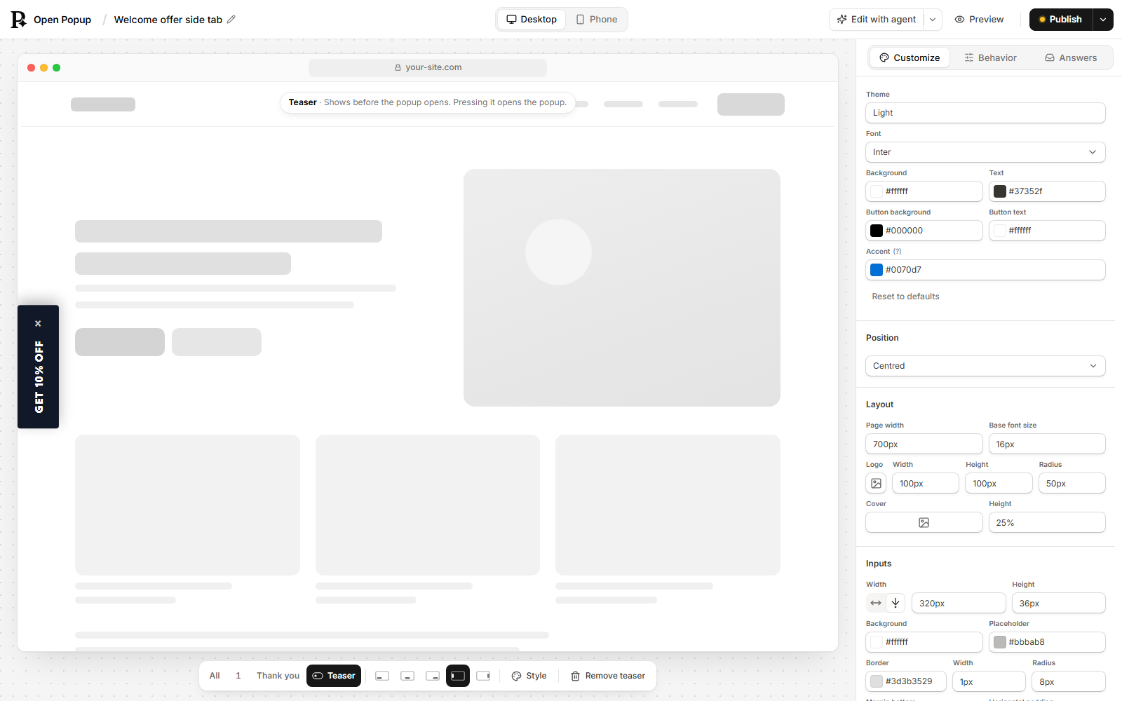
The teaser is a small pill on the page that opens the popup when it’s pressed. It can stand in for the trigger, or bring the popup back for someone who closed it.
"teaser": {
  "when": "after-close",
  "label": "Still want 10% off?",
  "sub": "Ends Sunday",
  "icon": "🎁",
  "position": "bottom-left"
}| Field | Means |
|---|---|
when | before: the pill is up while the popup could open and hasn’t yet on this page. With the manual trigger it’s the only way in. after-close: it appears once the visitor closes the popup, on later pages too, and never after a submit. both: either. |
label | The words on the pill, at most 40 characters. |
sub | Optional. A smaller second line, at most 60 characters. Not drawn on a side edge. |
icon | Optional. The left image: an emoji, or an https:// link to a small picture, drawn as a round thumbnail. |
position | bottom-left (the default), bottom-center, bottom-right, or left / right: a tab on that side edge, reading sideways. |
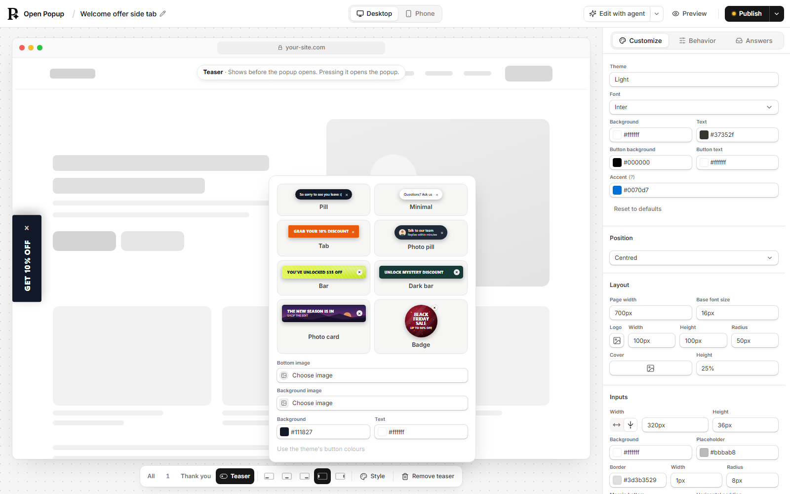
shape | pill (the default), tab (square corners, capitals), bar (a wide strip) or circle (a round badge, which stays upright on a side edge). |
background, text | Optional colours, like #0f766e. Left out, the pill takes the colours of the theme’s button. |
image | Optional. An https:// picture behind the words, such as a badge’s face or a photo card’s background. |
The builder’s eight looks (Pill, Minimal, Tab, Photo pill, Bar, Dark bar, Photo card and Badge) are just combinations of shape, the colours and the pictures.
Pressing the pill opens the popup, so the frequency still decides. An after-close pill needs a frequency that lets the popup show again, such as always, or it never appears. Your agent’s audit_popup points that out. Closing the pill hides it for the rest of the visit.
After someone submits
Answers are always saved, whatever you set here. Where answers go covers each of these in full.
| Field | Means |
|---|---|
action | { "kind": "close" } closes the popup. { "kind": "webhook", "url": "https://…" } also posts the answers to your URL. |
redirect | A path on your site (/thank-you) or an https:// page. After a submit the visitor goes there. On a popup with no questions, its button goes there instead of closing. |
partial | true saves each step of a multi-step popup as the visitor moves forward, so an email given on step 1 is kept even if they close step 2. Unfinished answers are marked incomplete. |
autoresponder | { "subject": "…", "body": "…" } emails the visitor after they submit, with optional fromName and replyTo. {{Email}} or any other question’s label puts their answer in. |
marketing | Which Mailchimp or Klaviyo lists the leads join (lists), and which question is the consent checkbox (consent). |
turnstile | null. Ignored: the spam check is the Spam check block (below). |
Questions that depend on answers
A CONDITIONAL_LOGIC block shows, hides or requires other blocks, or jumps to a page, depending on earlier answers - for example a different follow-up for a low and a high NPS score. Ask your agent to call popup_schema for the exact shape and an example.