Grow your email list
Bakery VIP list for early holiday pre-orders
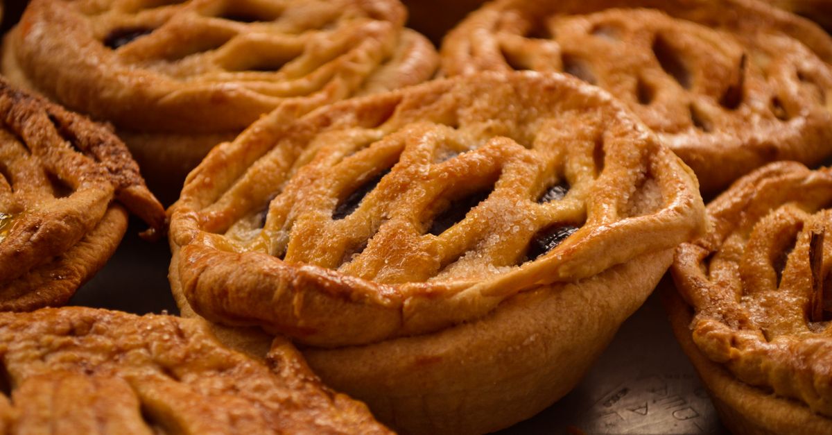
A local bakery's VIP list: sign up and get the holiday pre-order link a day before the public, for the shop you visit. Scarcity is real here, so a small ask converts.
Grow your email list
A local bakery's VIP list: sign up and get the holiday pre-order link a day before the public, for the shop you visit. Scarcity is real here, so a small ask converts.
Grow your email list
A travel deals site catches leaving visitors with fare alerts from their own airport: the easy question first, then the email. Localised alerts beat a generic deals newsletter.
Grow your email list
A welcome offer for a DTC fashion label: 10% off the first order in exchange for an email, shown a few seconds into a first visit and kept quiet for two weeks after.
Grow your email list
An online course creator's free 3-lesson mini-course, opened from a 'Start the free lessons' button on the sales page. Name and email; the visitor asked for it, so it opens on demand.
Grow your email list
A content upgrade for a recipe blog: once a reader is well into a post, a corner box offers a free printable weekly meal plan with shopping list. Earned attention, one field.
Grow your email list
A home and garden shop's seasonal list: planting reminders and frost alerts by email, with an optional mobile number for texts. The timely promise is what earns the sign-up.
Grow your email list
A fitness coach's fullscreen welcome mat for first-time visitors: a short silent workout clip, then a free 4-week home workout plan for a first name and email. Shown once, easy to wave away.
Grow your email list
A specialty roaster's early-access list: email on step one, then brew method (picked from photos) and roast taste, so drop emails can be split by filter vs espresso drinkers.
Grow your email list
A quiet centred signup that waits ten seconds, promises one email per post and asks for nothing but an address. Shows at most once a week.
Grow your email list
A nonprofit's slide-in for readers who finish a story: one field report a month by email, no donation ask up front. Builds the list that later donation appeals go to.
Grow your email list
A pet store's birthday club: the pet's name and birthday plus an owner email, so the shop can send a treat on the day. Personal data that makes every later email more relevant.
Grow your email list
A slim bottom bar for a newsletter-first publisher: one line on what the briefing is, one email field, and it stays out of the article's way. Quiet for a month once closed.
Grow your email list
A top bar for a SaaS company blog that sells the newsletter on its format, one product teardown every Tuesday, and asks for a work email. Unobtrusive enough to sit on every post.
Grow your email list
An indie skincare quiz: one tap on skin type first, then the email to send a matched routine. Leading with the easy question lifts completion and segments the list from day one.
Grow your email list
A 10% welcome code for an email, opened after 30 seconds or sooner from a tab on the left edge that is up from the first page. Once they have the code, neither shows again.
Save leaving visitors
A one-tap exit survey for pricing pages: pick the reason you're leaving, then an optional note and email. Tells you whether it's price, features or timing.
Save leaving visitors
Catches shoppers as the pointer heads for the tab bar and trades a 10% code for an email. On phones, where there is no exit intent, it opens after 20 seconds.
Save leaving visitors
Catches shoppers leaving with a full bag and trades a 48-hour 10% first-order code for their email, so the cart can be followed up even if they go.
Save leaving visitors
Offers a practical playbook to visitors leaving a consultancy site, for a work email and company size - a softer ask than a sales call that still qualifies the lead.
Save leaving visitors
A slim top bar for a local gym: visitors about to leave get a free 3-day pass for their email. Most gym traffic is mobile, so the touch fallback fires sooner.
Save leaving visitors
A full-screen exit offer for a jewellery brand: free engraving on the first piece instead of a discount that cheapens the product, plus a gift-or-self tag for follow-up.
Save leaving visitors
A no-form bottom bar that reminds leaving shoppers about the free-delivery threshold and links them back to their basket. Low friction, once per visit.
Save leaving visitors
Opens from a Watch price button on product pages and takes an email plus a target price, so undecided shoppers come back when the price is right instead of buying elsewhere.
Save leaving visitors
Lets visitors who leave the booking flow ask to be told if the rate for their check-in date drops, keeping them booking direct instead of on an OTA.
Save leaving visitors
A two-step slide-in for big-ticket carts: an email to save the cart for later, then one tap on when they plan to buy, so follow-ups land at the right time.
Save leaving visitors
A corner slide-in for readers deep in a course page who haven't enrolled: ask the team a question by email instead of leaving with it unanswered.
Save leaving visitors
After a minute and a half on the site, asks what would help most - test drive, trade-in, finance - then takes a name and phone number for a callback at a good time.
Save leaving visitors
Rescues meal-kit visitors about to leave with three free meals for an email, then asks household size and exclusions so the first box can be tailored.
Promote an offer
Center popup that trades an email for a 30% Black Friday code, revealed on the thank-you screen. Shown after 8 seconds, once a week, so browsers get the offer before they bounce.
Promote an offer
Quiet corner slide-in for a buy-two-get-one-free book offer, shown once a reader has scrolled a third of the page. No form, just the deal and a link to the eligible shelf.
Promote an offer
Slide-in referral offer for a local car wash: visitor leaves their name, email and a friend's email, and both get $10 off a full valet. Shown to engaged readers at 60% scroll.
Promote an offer
Opens only when a visitor clicks your 'Get the deal' button and shows the online-order code with a link to order. No form, no nagging: it appears exactly when someone asked for it.
Promote an offer
Top bar that pairs a seasonal sale with a free-delivery threshold, the two facts that lift basket size. Shows as visitors land, in the brand's green, and stays away for a day once closed.
Promote an offer
Two-step popup for a New Year membership push: pick a goal, then leave name, email and mobile to claim no joining fee and a £19 first month. Fires halfway down the page, where intent is highest.
Promote an offer
Center popup that wins bookings back from the OTAs: 10% off and free breakfast for booking direct, in exchange for an email and arrival date. The code appears on the thank-you screen.
Promote an offer
A slide-in shown only to visitors who arrived from your Instagram or TikTok links (by their UTM source) and are new to the site, with a first-order code for an email. Everyone else never sees it.
Promote an offer
Exit-intent popup for a gift shop's Mother's Day window: 10% off plus free gift wrap for an email, with the code on the thank-you screen and the last order date in the copy.
Promote an offer
Center popup for a course launch week: a short silent clip of a lesson, the launch price and the day it ends, and an email for one reminder before the price goes up. Once per visit.
Promote an offer
Two-step center popup: dog or cat (picked from photos) and size first, then email for half off the first subscription box. The pet answers segment your welcome emails from day one.
Promote an offer
Bottom bar that nudges visitors towards annual billing with two months free and links to the annual pricing view. Appears after 20 seconds and stays quiet for a week once dismissed.
Promote an offer
Full-screen takeover for a short flash sale: one bold line, the discount, and a link straight to the sale page. Shows on landing, once per visit, and closes with one click.
Promote an offer
Slide-in that asks what the visitor drinks, with a photo on each style, then trades an email for 15% off a 6-bottle mixed case. The easy first question tags every lead with a taste.
Make an announcement
A corner card for parents reading about the school: the application deadline, what to have ready, and a link to apply. Appears after real reading and rests for three days.
Make an announcement
A thin top bar announcing a free-shipping threshold with a link to the details. No form, shown once a day.
Make an announcement
A full-screen takeover for a disaster appeal: what happened, what a gift buys, and a link to the emergency donation page. Rare, urgent news earns the whole screen; at most once a week.
Make an announcement
A bottom bar that lists changed holiday hours a few seconds after a guest arrives, with a link to book the days you are open. Saves the wasted trip and the angry review.
Make an announcement
A slim top bar that tells shoppers the last day to order for delivery before the holidays, with a link to the full cut-off dates. Urgency without a discount, once a day.
Make an announcement
A bottom bar telling visitors which cookies a small site uses, with a link to the privacy policy. Notice only: it records no consent and blocks nothing, so it suits essential-cookie-only sites.
Make an announcement
A top bar, once per visit, that warns customers when online banking will be offline and what still works, so they move money before the window instead of calling support during it.
Make an announcement
A bottom bar that tells visitors the renovated service centre is open again, with new hours and a link to book. Appears once they start browsing and rests for two weeks.
Make an announcement
A two-screen modal for readers mid-article: what changes about free articles and when, then what subscribers keep and a link to plans. An honest change notice keeps trust.
Make an announcement
A large centred panel that opens when a visitor clicks a Tickets link, with the on-sale date, the member presale and the ticket-page link. Answers the question at the moment it is asked.
Make an announcement
A corner slide-in that walks users through a launch in two short screens: the headline feature with a short silent clip, then the second improvement and a link to the changelog.
Make an announcement
A centred notice patients see once, the moment they land, with the new address, the date the move takes effect and a link to directions. Stops people turning up at the old door.
Generate leads
A low-pressure bottom bar for financial-advice sites: first name, phone and a time window. People who won't book a meeting will often accept a call back.
Generate leads
Lets a dental clinic's visitors ask for an appointment without phoning: patient type, reason and a preferred day first, then name and mobile so reception can confirm.
Generate leads
A two-step corner form for law-firm practice pages: the matter type and urgency first, then name, phone and an explicit contact consent the firm can rely on.
Generate leads
Catches agency-site visitors on their way out with a free, specific deliverable: a recorded audit of their own site. Asks only for the site and an email, plus one optional focus.
Generate leads
A full-screen last chance for solar installers: three quick qualifiers (bill, ownership, ZIP) and an email for a personalised savings estimate. Renters self-select out.
Generate leads
Offers homeowners a free local valuation once they have scrolled half a listings or blog page. Address and selling timeline first, then email and an optional phone.
Generate leads
A small corner offer for managed IT providers: a free 30-minute security assessment for readers of service pages. Company size and a work email, nothing more.
Generate leads
A two-step application opened by the Apply button on a job page: contact details and the role first, then the CV as a PDF or Word file and a short note. Files stay private; you download them from Leads.
Generate leads
A top bar for home-services sites after a storm: a free inspection offer with just phone and ZIP, so a crew can call and schedule the same day.
Generate leads
For bootcamps and course sellers: program and experience first, so the advisor can prepare, then name and email to book a 15-minute call. Shows after most of a curriculum page is read.
Generate leads
A car dealer's Book a test drive button opens a two-step form: model, day and time of day first, then a photo and name and mobile. The sales desk gets a slot request, not a vague enquiry.
Generate leads
An insurance broker's quote form opened by any Get a quote button: coverage and ZIP, then renewal timing, then contact details with consent. Easy questions first, personal details last.
Generate leads
Opens from your Book a demo button, asks team size and current tool first, then work email. Sales gets context before the call and the visitor commits before the ask.
Generate leads
Opens from a Book a demo button. Name and work email first, then team size and what they want to solve, so sales gets a qualified lead.
Generate leads
A gentle corner prompt for wedding photographers and venues: couples enter their date and venue and get an availability answer by email. The date is the qualifier.
Collect feedback
A 'Request a feature' form for a mobile app's landing page: what to build, which phone they use, and an optional email to hear when it ships. Opens from the site's own button.
Collect feedback
A corner slide-in that appears near the end of a page and asks for a star rating plus an optional comment. Once per visit.
Collect feedback
A one-question top bar for a fitness studio: members give their latest class 1-5 stars as soon as they open the site. Asked at most once a week, so regulars aren't nagged.
Collect feedback
A slim bottom bar on help-center articles that asks one yes/no question once the reader has scrolled most of the way. Tells the support team which articles fail.
Collect feedback
A two-step slide-in for guests in the manage-booking area: rate the stay 1-10, then say whether they'd come back and what to improve. Catches unhappy guests before they write the public review.
Collect feedback
A one-question attribution survey for an online shop: where did you first hear about us, with channels shuffled to avoid order bias and a box for anything else. Fills the gap ad dashboards leave.
Collect feedback
A two-step donor survey for a charity site: why they gave and how well they're kept informed, then which programmes and which channel they want updates on. Anonymous, asked once.
Collect feedback
One 0-10 recommend question in a bottom bar after 30 seconds of reading. Asks each visitor at most once every three months.
Collect feedback
A small star rating on the order-confirmation page: how easy was checkout, plus an optional note. Asked once per shopper, while the purchase is fresh.
Collect feedback
A three-step survey for university visitors about to leave: what they want to study, what matters in choosing, and an optional email for the course guide. Admissions learns why people browse and go.
Collect feedback
A slide-in for an online magazine that asks readers to pick up to three topics they want more of and how often they visit. Research that plans the next quarter's editorial calendar.
Collect feedback
A full-screen 'how was your visit' form that opens from a Rate-your-visit button: stars for food and service, which sitting, and a note for the kitchen. Built for phones at the table.
Collect feedback
A two-step NPS slide-in for logged-in SaaS users: a 0-10 score with labelled ends, then one open 'what's the main reason' box. Asks every 90 days, not every visit.
Fill waitlists and events
Opens when a shopper clicks Notify me on a sold-out product and takes their email and size, so the restock email goes only to people who can buy it. Re-opens on every click.
Fill waitlists and events
A two-step booking for a first class: choose the class and a day (past days and Sundays greyed out), then name and email. Commitment first, contact details second.
Fill waitlists and events
A two-step gala RSVP for a nonprofit: ticket type and number of seats first, then name and email for the invitation pack. Leads with the cause, not the dinner.
Fill waitlists and events
A first-visit waiver opened from the booking page, in three short steps: the member's details, an emergency contact, then a required agreement tick and a drawn signature. Nobody signs paper at the front desk.
Fill waitlists and events
A two-page RSVP opened from the site's Register buttons: name, work email and pass type first, then the sessions they plan to attend, so the organiser can size rooms before the day.
Fill waitlists and events
Stops leaving visitors with a concrete class, not a discount: pick a workshop date, how many seats (up to 4) and an email to hold them for 24 hours. Small, honest scarcity.
Fill waitlists and events
A sneaker-drop signup with its own look written in custom CSS: square corners, heavy black borders and an all-caps button, on top of the theme's colours. Asks for an email and their size.
Fill waitlists and events
An early-access signup that collects an email and what brought the visitor in, so the first invites go to the right people. Shown once.
Fill waitlists and events
A two-step waitlist for a hardware launch: email first, then a bench photo and one question about what they will build, so the first batch goes to the right people. Shows once, after a real scroll.
Fill waitlists and events
A corner slide-in that reserves a place in a small-batch pre-order: email, how many (capped at 2) and grind. Scarcity is real, so the copy says the number and the cap.
Fill waitlists and events
A seat-saving RSVP for a small event: name, email and dietary needs, opened when a visitor is 40% down the page and shown once.
Fill waitlists and events
A slim bar across the top of the site that asks for one thing, a work email, to request private beta access. Low-friction, always visible until answered or dismissed, shown once per person.
Fill waitlists and events
An opening-night guest list that greets visitors on arrival: name, email, party size (1 to 6) and a seating time, so the kitchen can plan covers before the doors open.
Fill waitlists and events
When a cohort is full, a bottom bar on the course page collects waitlist emails and which start date suits them, so the next cohort can open already half-full.
Fill waitlists and events
Catches visitors leaving the pricing or blog pages with a live webinar seat instead of a discount: pick a session time, leave a work email. Two time zones, one field each.
Guide visitors
A corner slide-in for first-time visitors with four links: the two-minute tour, templates, pricing and a live demo. Orients people instead of asking them for anything.
Guide visitors
Three-step matcher for property sites: buy or rent and the kind of home, picked from photos, then area and bedrooms, then name and email so an agent can send matching listings early.
Guide visitors
Opens when a shopper clicks "Size guide" on a product page: rider height to frame size at a glance, plus links to the full guide and a free in-store fitting.
Guide visitors
A top bar that appears once a reader is halfway down a story, turns interest into a concrete ask (what $25 pays for) and links straight to the donate page.
Guide visitors
A slim bottom bar that sends web visitors to the app download page with the one reason to switch. No fields, dismissible, and quiet for a month once closed.
Guide visitors
Full-screen, three-step gift finder that catches stuck shoppers on their way out: who it's for (picked from photos), the budget, then an email with a hand-picked shortlist.
Guide visitors
Slides in near the end of an article with three next reads and a subscribe link, so a finished reader goes deeper instead of back to search.
Guide visitors
Asks skin type, then the one concern that matters most, then emails a matched three-step routine. A quiz feels like help, not a signup form, so more visitors finish it.
No template matches all of that.
Loosen a filter, or describe the popup to your agent - it will build it from scratch.